Modern Responsive Website Footer Design with Tailwind CSS in web design trends
Looking for a sleek, responsive, and user-friendly footer design for your website? This article showcases a fully customizable Tailwind CSS footer built for performance, usability, and modern aesthetics. Ideal for startups, portfolios, or business sites — plug it into your project and elevate your site’s experience instantly.
Aditya upadhyay
6/16/20253 min read
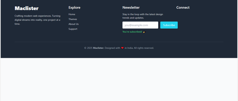
This is the latest footer design I’ve been building for you all — crafted with care to be clean, modern, and fully responsive across every device. Whether you're a startup, freelancer, or business owner looking to make a bold digital statement, this footer brings not just good looks but strategic functionality. Every section — from the Maclister branding, to essential quick links, the email newsletter form, and crisp social media icons — has been intentionally laid out to enhance usability, user trust, and aesthetic appeal.
The codebase is powered by Tailwind CSS, giving you full control over customization without clutter. It’s mobile-first, loads fast, and is easy to plug into any modern web project. Subtle hover animations, clean layouts, and accessibility-friendly interactions are baked right in. Whether your visitors are browsing from a phone, tablet, or desktop — this footer maintains a sleek, professional vibe that elevates your brand presence
<!DOCTYPE html>
<html lang="en">
<head>
<meta charset="UTF-8" />
<meta name="viewport" content="width=device-width, initial-scale=1.0" />
<title>Maclister Footer</title>
<!-- Tailwind CSS CDN -->
<script src="https://cdn.tailwindcss.com"></script>
<!-- Font Awesome for Social Icons -->
<script src="https://kit.fontawesome.com/a076d05399.js" crossorigin="anonymous"></script>
<!-- Tailwind Config for Custom Colors -->
<script>
tailwind.config = {
theme: {
extend: {
colors: {
primary: '#1f2937', // dark slate
accent: '#22d3ee', // cyan-400
hoverAccent: '#06b6d4', // cyan-500
soft: '#e0f2fe', // sky-100
}
}
}
}
</script>
<style>
.footer-hover:hover {
transform: translateY(-2px) scale(1.03);
transition: all 0.3s ease-in-out;
}
input:focus {
outline: 2px solid #06b6d4;
}
</style>
</head>
<body class="bg-gray-50 text-gray-800">
<!-- FOOTER -->
<footer class="bg-primary text-white py-12 px-6 md:px-20">
<div class="max-w-7xl mx-auto grid grid-cols-1 sm:grid-cols-2 md:grid-cols-4 gap-10">
<!-- Branding -->
<div>
<h2 class="text-3xl font-extrabold text-white">Maclister</h2>
<p class="mt-4 text-sm text-gray-300 leading-relaxed">Crafting modern web experiences. Turning
digital dreams into reality, one project at a time.</p>
</div>
<!-- Quick Links -->
<div>
<h3 class="text-xl font-semibold mb-4 text-white">Explore</h3>
<ul class="space-y-2 text-sm text-gray-300">
<li><a href="#" class="hover:text-accent transition-all">Home</a></li>
<li><a href="#" class="hover:text-accent transition-all">Themes</a></li>
<li><a href="#" class="hover:text-accent transition-all">About Us</a></li>
<li><a href="#" class="hover:text-accent transition-all">Support</a></li>
</ul>
</div>
<!-- Newsletter -->
<div>
<h3 class="text-xl font-semibold mb-4 text-white">Newsletter</h3>
<p class="text-sm text-gray-300 mb-3">Stay in the loop with the latest design trends and updates.</p>
<form class="flex flex-col sm:flex-row gap-3" onsubmit="subscribe(event)">
<input id="emailInput" type="email" required placeholder="you@example.com"
class="px-3 py-2 rounded w-full sm:w-auto text-gray-800 focus:outline-none">
<button type="submit" class="bg-accent hover:bg-hoverAccent px-4 py-2 rounded text-white footer-
hover">Subscribe</button>
</form>
<p id="subscribeMsg" class="text-sm text-green-400 mt-2 hidden">You're subscribed! 🎉</p>
</div>
<!-- Social Media -->
<div>
<h3 class="text-xl font-semibold mb-4 text-white">Connect</h3>
<div class="flex gap-4 text-2xl text-gray-300">
<a href="#" class="hover:text-accent transition" aria-label="Facebook"><i class="fab fa-facebook-f"></i></a>
<a href="#" class="hover:text-accent transition" aria-label="Twitter"><i class="fab fa-twitter"></i></a>
<a href="#" class="hover:text-accent transition" aria-label="Instagram"><i class="fab fa-instagram"></i></a>
<a href="#" class="hover:text-accent transition" aria-label="LinkedIn"><i class="fab fa-linkedin-in"></i></a>
</div>
</div>
</div>
<!-- Divider -->
<div class="border-t border-gray-700 mt-12 pt-6 text-center text-sm text-gray-400">
© 2025 <strong>Maclister</strong>. Designed with ❤️ in India. All rights reserved.
</div>
</footer>
<!-- JavaScript -->
<script>
function subscribe(event) {
event.preventDefault();
const emailInput = document.getElementById('emailInput');
const message = document.getElementById('subscribeMsg');
if (emailInput.value.trim()) {
message.classList.remove('hidden');
emailInput.value = '';
}
}
</script>
</body>
</html>
💡 How to Use This Footer:
Copy the entire HTML code into the bottom of your webpage — ideally right before the closing </body> tag.
Make sure the Tailwind CSS CDN and Font Awesome CDN scripts are loaded in your <head>.
Update the text, links, and social media URLs with your own content.
The newsletter form is ready to capture emails — you can link it to your email marketing service like Mailchimp, ConvertKit, or simply collect emails using a custom backend script.
Customize the colors or fonts easily by tweaking the Tailwind utility classes or extending Tailwind's config.
This footer is part of a larger design system I'm building under the Maclister brand — a vision to help creators and businesses build beautiful, high-performance web experiences effortlessly. Feel free to use it, remix it, or build upon it for your own projects. And as always — pixel perfection is the goal. Let’s keep designing forward.